The Raw Chemist
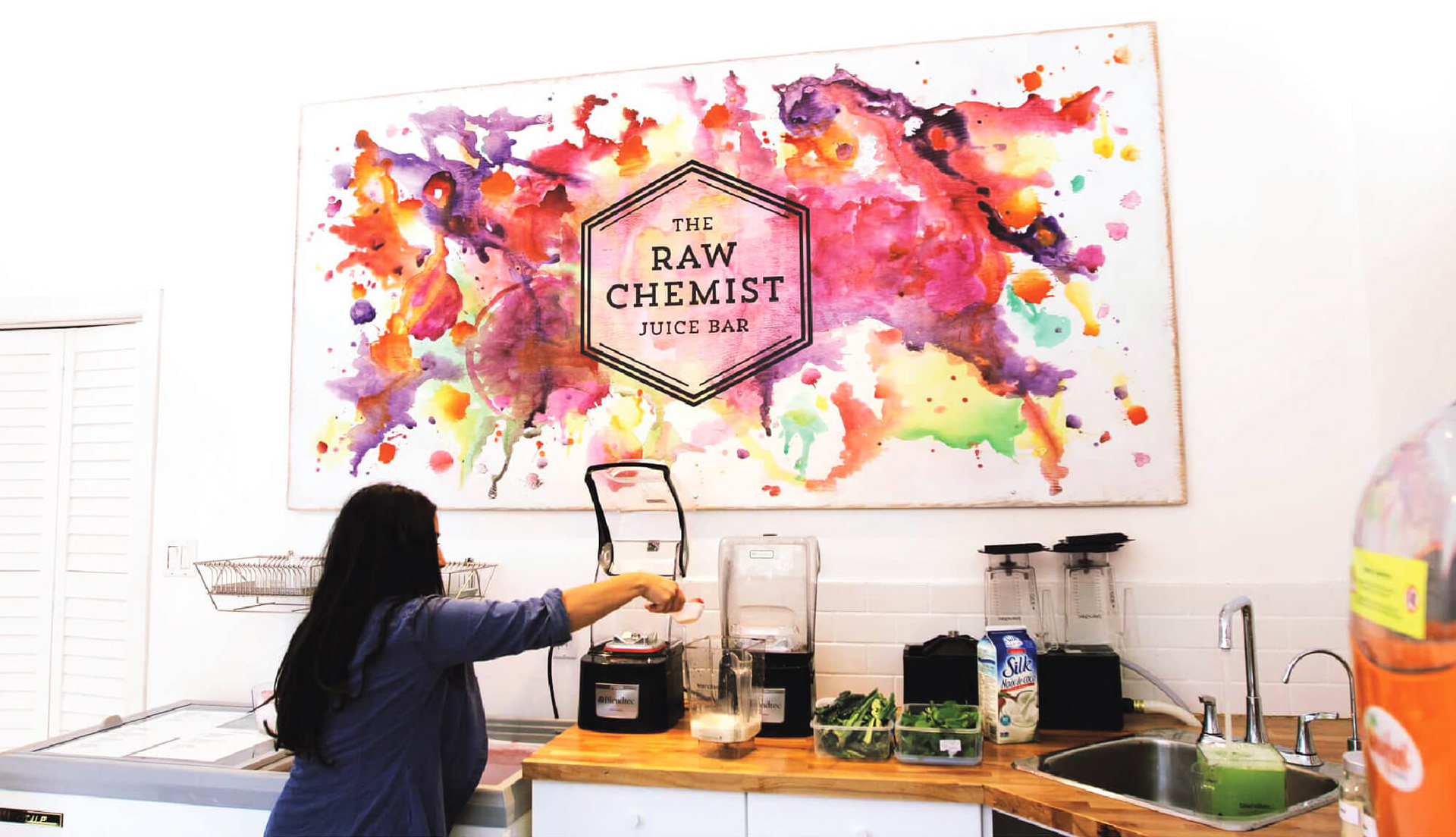
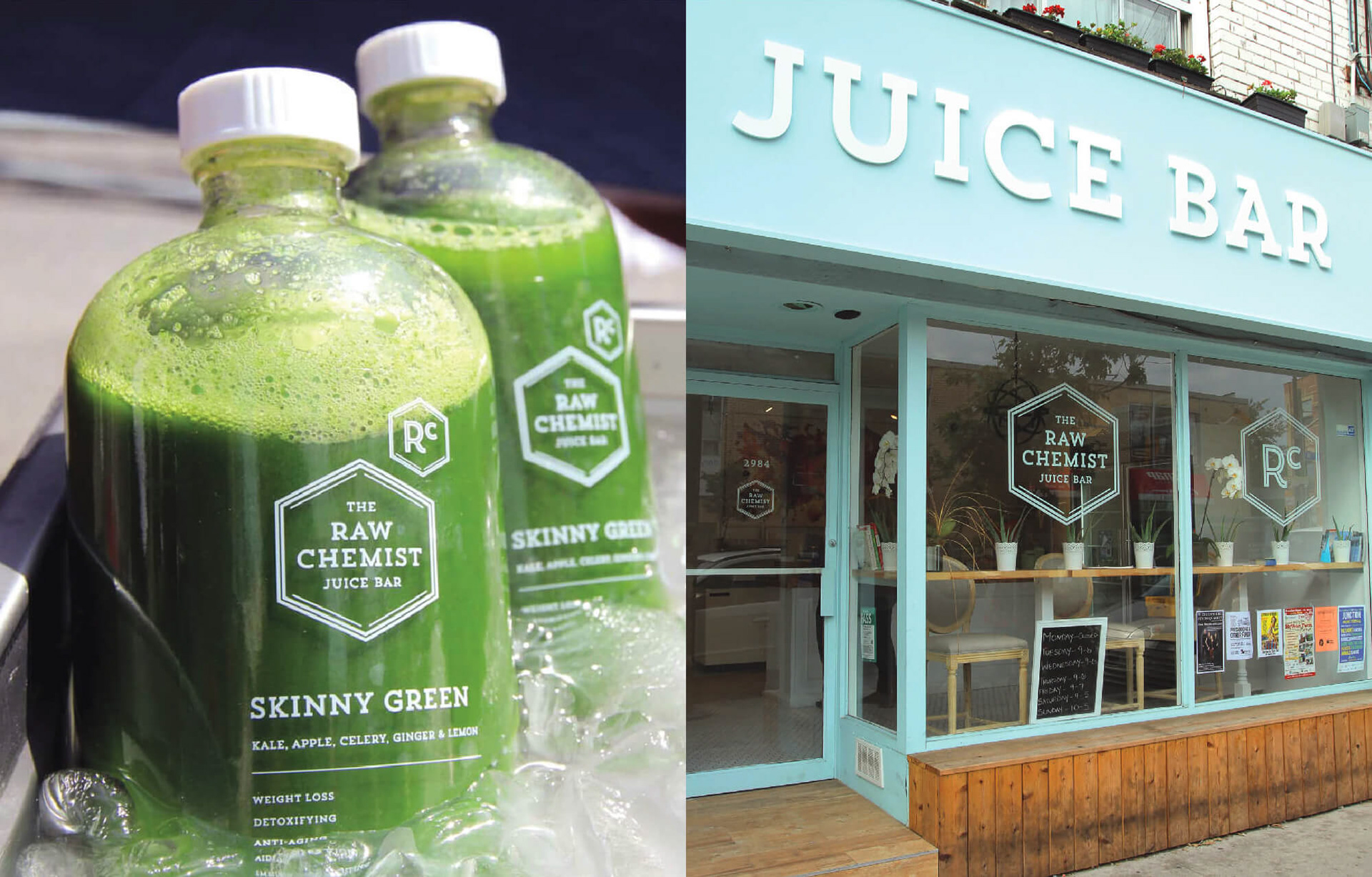
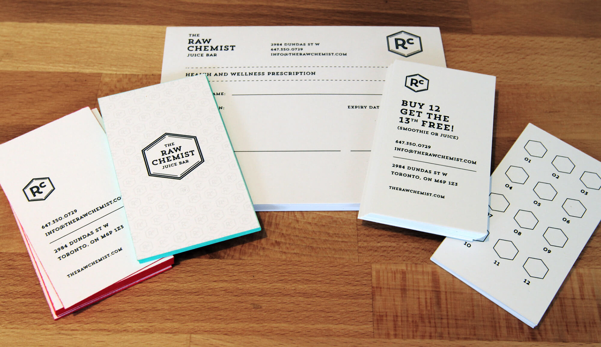
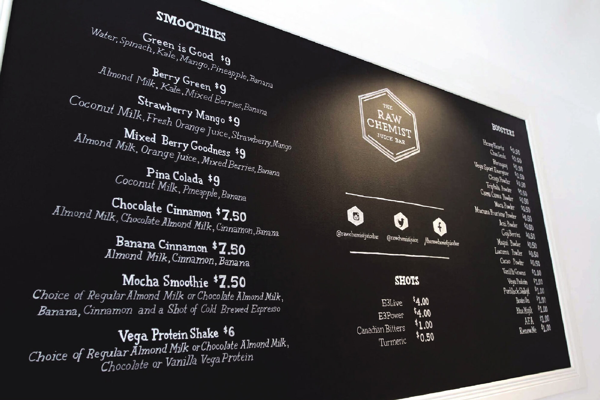
The Raw Chemist is a juice and smoothie bar built around a philosophy of whole, unheated ingredients and food-as-wellness. The brand needed to communicate purity, energy, and modern simplicity – without slipping into the typical tropes of “health food” branding. I developed an identity system inspired by the elemental nature of raw ingredients and the scientific clarity suggested by the name. Approach: The symbol draws on geometric chemistry forms, using a hexagonal structure and internal linework to reference natural compounds in an abstract, contemporary way. To ensure the mark carried no unintended scientific meaning, I consulted with a chemist to validate the structure. The visual system balanced these geometric elements with fresh colour and clean typography, extending naturally into menus, packaging, environmental graphics, and digital assets. Outcome: The final identity created a distinctive, modern presence for the business – clear, bright, and grounded in the owner’s belief in simple, whole-food nutrition. The system scaled smoothly across product packaging, environmental graphics, and digital channels.
2014
Brand Identity, Environmental Graphics, Packaging + Menu System
Lead Designer (Visual Inclination)